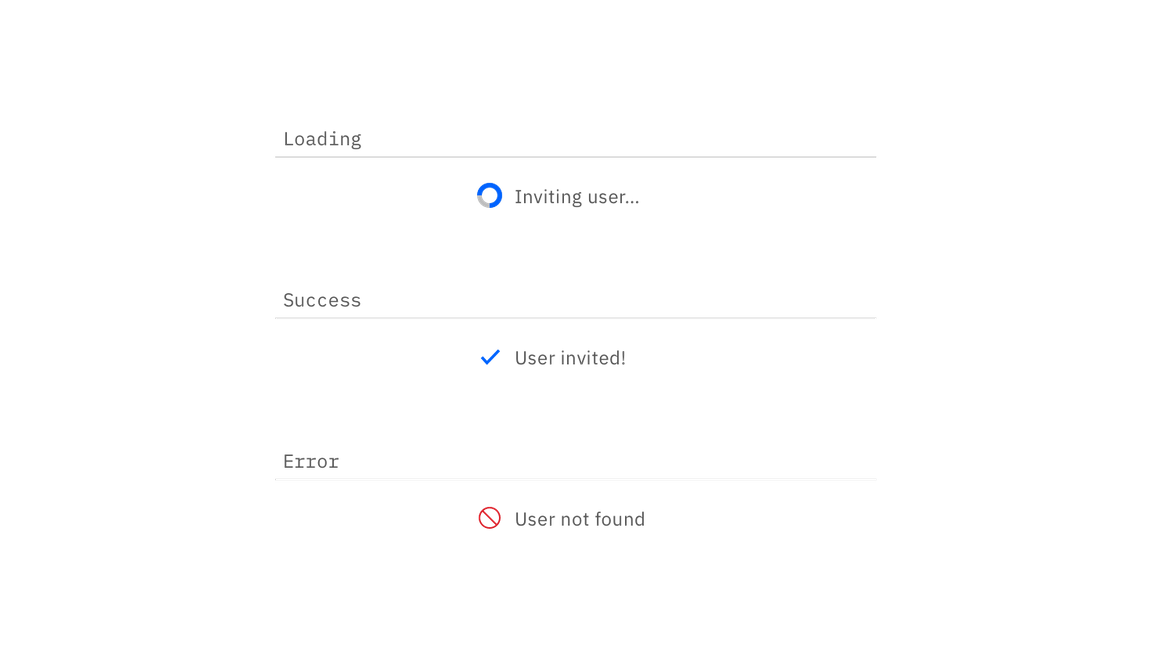
| Class | Property | Color token |
|---|
.bx--loading__svg | stroke | $ui-03 |
.bx--inline-loading__checkmark | color | $interactive-01 |
.bx--inline-loading__text | color | $text-01 |
Button text should be set in sentence case, with only the first word in a phrase and any proper nouns capitalized.
| Class | Font-size (px/rem) | Font-weight | Type token |
|---|
.bx--inline-loading__text | 14 / 0.875 | Regular / 400 | $body-short-01 |
| Class | Property | px / rem | Spacing token |
|---|
| Spinner | width, height | 16 / 1 | – |
| Checkmark | width, height | 16 / 1 | – |
The inline loading component should appear during any user action loading. If button is used to trigger the action, the inline loading component should replace that button.


